I can pretty much remember when it started, my love for lettering. It would have been about 1974, I had just learned to draw block letters, which was outstanding!
It went to another level when I started to understand how to put a shadow behind the letter. (Correct nomenclature is that its actually a 'fade').
This took me way ahead of the other budding artists in Miss. Jarrett's Belmont Primary School class.
From there there has always been art in my life. I always did art at school and through my secondary years we had two very good art teachers that managed to bring the best out of a class of general '80s freaks and geeks.
Looking back at those classes there were some very talented people, some continue to make a career from their art and are very good at it.
I however used my time more on the spurious pursuits of making coffee (badly) and perfecting toasting the perfect bread (exemplary) and pretty much going along with the quote from Ian Dury;
"I got good enough (at art) to realise I wasn't going to be very good."
But I did really enjoy it. Fortunately, like Ian, I had an alternate and have spent the past twenty-something years in the entertainment industry getting paid to muck around with movies, television shows and a bit of music.
In all this I kept up scribbling and slinging paint, predominately working on signs, lettering, gold leaf and calligraphy.
So we get to this website, it seemed the easiest way to me showcasing the lettering, signs, calligraphy and graphics that I've been noodling with.
Have a squiz, and cheers!

Photograph courtesy of Frodo Photograpy
the old ways
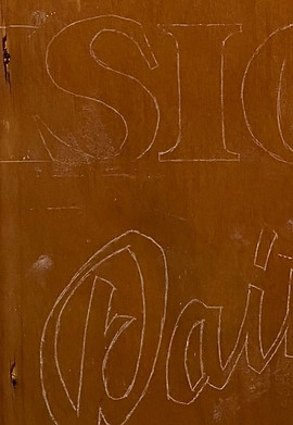
Signs like the below have stood the test of time, a little bit beaten up, a bit raggedy, faded paint and all. I would find it hard to imagine that vinyl cut and computer generated signs will be as long lived.
Sure they're 'perfect' and all the verticals are perpendicular with the horizontal, and all the spacing is to the 'nth' degree, but no feeling, no history.
I may post a few more of these when I see them. I love a good ole faded sign! Especially with a Joe Cocker tour sticker from 1977!


Even the fun police used hand done signs

evolution of a sign
Here's a blow-blow look at a simple sign.
It started with the bottom of an old drawer. Add a few coats of varnish and a bit of bracing on the back and we're good to go.
First up is rough outline then the paint, being white here.


Next up is the blues. A pale blue body, and in the case of 'Sign' a dark blue border.
There is also the dark blue fade (or shadow) on the white lettering


Then the red appears...

Lastly the white highlights and a some shading on the fade to give the lettering some weight.